website :
? Research
The first and most important step of our process was research. Involved understanding the user’s needs, goals, pain points, and behaviors. We reached out to 50 parents and 25 children from different backgrounds and locations and asked them about their current habits, preferences, and pain points related to app usage, screen time, online safety, etc.
we used various methods such as interviews, surveys, personas, user journeys, etc. to gather data and insights about our target users.
✨ User persona
Based on our user research data, we created some personas to represent our primary user groups: parents and children. Personas are fictional characters that embody the characteristics, goals, motivations, and frustrations of our real users. They help us empathize with our users and design solutions that meet their needs. Here is one of the personas we created:


✨ Competitive analysis
We also, conducted a competitive analysis to see what other parental control apps are offering and how they differ from our app idea.


? Define the user problem
Based on our research findings, we needed to define the main problem or challenge that our app will solve for the users. We found that parents want to monitor their children’s app usage, set time limits, block inappropriate content, etc.
Our user research revealed some interesting insights and patterns about our target users. We found that parents were concerned about their children’s excessive screen time, exposure to inappropriate content, cyberbullying, and lack of physical activity. They also wanted to have more control and visibility over their children’s app usage and to set healthy boundaries and rules for them.
? Design
In This stage, we started generating ideas and solutions for our user’s problems.
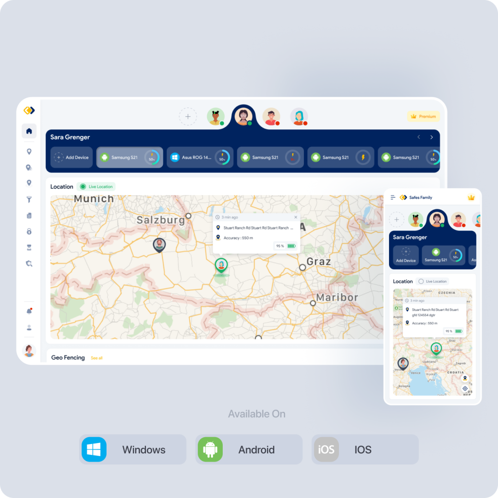
Our online parental control app will be available on iOS, Android, and web platforms so that parents and children can access it from any device they prefer. However, parents and children will have different apps with different features and interfaces.
I’ll represent the parent’s app design flow for web and mobile In the following :
✨ User flow
We designed a user flow to illustrate the path that a user takes to complete a specific task or goal in the app. It helps to illustrate the user’s journey and interactions and to optimize the app’s usability and functionality. This application has many features so we defined a dedicated flow for every part. Here is the starting point :


✨ Wireframing
We used some techniques such as brainstorming, sketching, wireframing, etc. to explore different concepts and layouts for our app. This helped us to organize the content and elements, and to test the usability and logic of the app. Here are some examples of our wireframes for mobile and web :


✨ User interface design
In this stage, we started designing UI elements, such as colors, fonts, and icons to create a consistent and appealing visual design for our cross-platform application.
Our app’s UI design is simple, elegant, and user-friendly. We have used a light and soothing color scheme, clear and readable fonts, and intuitive icons and buttons.


I’ll describe some of our app features and their purposes:


Home page: This page displays some key information and statistics, such as the child’s app usage, screen time, location, etc.


Screen time: This is the page that allows users to monitor and manage their child’s screen time. It shows a chart of the child’s screen time over a period of time, such as a day, week, month, etc. It may also allow users to set screen time limits, view screen time reports, etc.


App usage: This is the page that allows users to monitor and manage their child’s app usage. It shows a list of apps that the child has installed or used on their device, along with the time spent on each app. It also allows users to set time limits, block or unblock apps, view app permissions, etc.


Location Tracking: This is the page that allows users to locate and track their child’s device. It shows a map with the device’s current or last known location, along with some details such as battery level. It also allows users to lock the device remotely, set location alerts or boundaries, view location history, etc.


Child management: This is the feature that allows users to add, edit, or remove their child’s profile on the app. They can access this feature from the settings page of the app.
Here are some other screens of this app :


✨ Prototype
In this stage, we made some mockups interactive and simulate the user flow and interactions of our product that can be tested with users and stakeholders. This helped us to validate our design assumptions and get feedback before development.
✅ Testing
In this stage, we evaluated the usability, desirability, and feasibility of our UI design with potential users. we used methods like user interviews, surveys, etc. to conduct testing sessions and collect feedback.
Then in an iterated flow, we analyzed the results and feedback from testing and make changes and improvements to our UI design accordingly. Iteration helped us to refine and optimize our UI design until it meets the user’s needs and expectations. You can use tools such as Google Analytics, Hotjar, etc. to measure the key metrics and indicators of our design’s success.
? Conclusion
In this page, we have described the online parental control application UI and UX process, the app pages, and some of the app features. We have also provided some examples and links to help you understand and visualize our app design better. Our app is designed to help you keep your family safer online, and to give you the flexibility to choose the right balance for your family. We hope you find our app useful and enjoyable.

